Slideshow
Adding a section
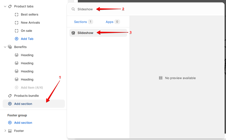
In order to add a section, you need to go to Customizer → Add Section → Slideshow.
Section settings
Enable rounded corners- the setting is responsible for displaying rounded corners of the media.
Slideshow settings
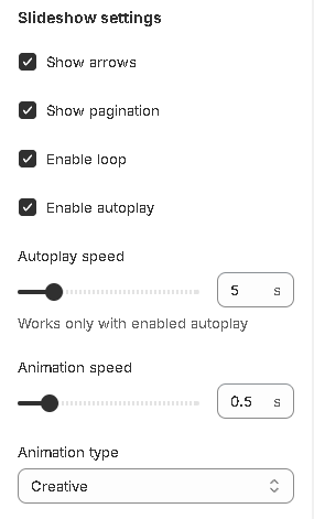
Show arrows- the setting is responsible for displaying the arrows for switching between slides;Show pagination- the setting is responsible for displaying pagination;Enable loop- the setting is responsible for setting the infinite scrolling of the slider;Enable autoplay- the setting is responsible for setting the automatic switching of slides;Autoplay speed- the setting is responsible for the speed of automatic switching of slides;Animation speed- the setting allows you to set the animation speed of switching slides;Animation type- the setting allows you to set the type of animation for switching slides:Fade

Slide

Flip

Creative

Parallax

Colors

Background- the setting allows you to set the background color of the section;Pagination- the setting allows you to set colors for pagination;Arrows background- the setting allows you to set the background color for the arrows for switching between slides;Enable arrows glass effect- the setting allows you to set the glass effect for the arrows background for switching between slides(info: This effect is working only when background opacity less than 1).Arrows color- the setting allows you to set the color for the arrows for switching between slides;Arrows border- the setting allows you to set the color for the arrows border for switching between slides;Arrows background (hover)- the setting allows you to set the background color for the arrows for switching between slides on hover;Arrows color (hover)- the setting allows you to set the color for the arrows for switching between slides on hover;Arrows border (hover)- the setting allows you to set the color for the arrow border for switching between slides on hover.
Layout
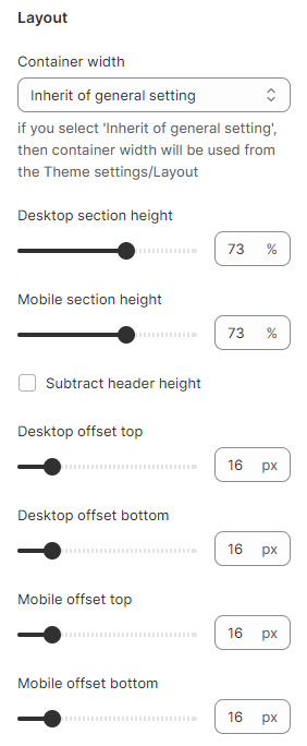
Container width- a container width of the section. If the “Inherit” value is selected then the container width is based on the group 'Layout' settings in the Theme settings;Desktop section height- the setting is responsible for the height of the section for the desktop;Mobile section height- the setting is responsible for the height of the section for mobile;Subtract header height- the setting is responsible for subtracting the header height from the slideshow size. This will be useful when you set the slideshow size to 100% and turn on the setting, then you will fit the announcement bar, header, and slideshow on one screen;Desktop offset top- top indent of the section on the desktop;Desktop offset bottom- bottom indent of the section on the desktop;Mobile offset top- top indent of the section on the mobile;Mobile offset bottom- bottom indent of the section on the mobile.
Accessibility
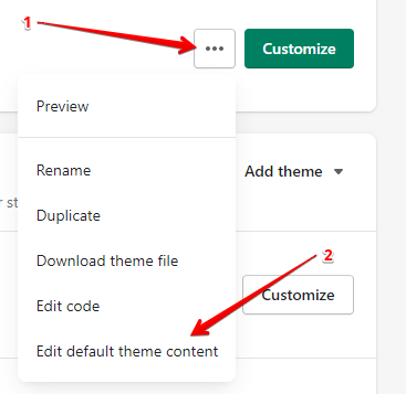
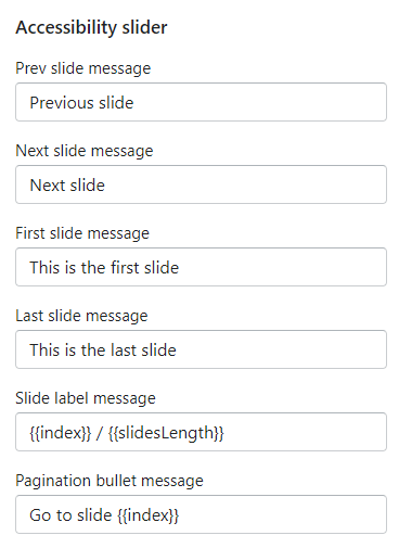
Accessibility content is in translations. To go, you need to click on the more options button in the customizer or in the online store (themes) and select edit languages:
General → Accessibility

General → Accessibility slider
Blocks settings
Block Image Slide
Content


Image (desktop)- the setting allows you to set the image for the desktop;Image (mobile)- the setting allows you to set the image for mobile;Heading- the setting allows you to set the text for the title;Text- the setting allows you to set the text for the text field;Button label- the setting allows you to set the label for the label;Button aria-label- the setting allows you to set the text for the aria-label attribute. The attribute is needed for accessibility;Button link- the setting allows you to set a link for the button;Open link in a new tab- the setting allows you to indicate how the link will open, in the current tab or the new;Make link clickable on the entire slide- the setting allows you to make the entire slide a link;Second button label- the setting allows you to set the label for the second label;Second button aria-label- the setting allows you to set the text for the second button aria-label attribute. The attribute is needed for accessibility;Second button link- the setting allows you to set a link for the second button;Open second link in a new tab- the setting allows you to indicate how the second link will open, in the current tab or the new.
Alignment

Text alignment inside block- the setting allows you to set the alignment for the text;Content alignment- the setting allows you to set the alignment for the content;Vertical content alignment- the setting allows you to set the vertical alignment for the content.
Colors
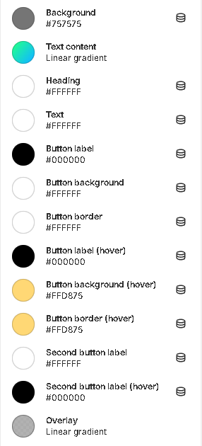
Background- the setting allows you to set the background color of the slide;Text content- the setting allows you to set the background for the text content;Heading- the setting allows you to set the color for the header;Text- the setting allows you to set the color for the description;Button label- the setting allows you to set the color for the button label;Button background- the setting allows you to set the background color for the button;Button border- the setting allows you to set the border color for the button;Button label (hover)- the setting allows you to set the color for the button label on hover;Button background (hover)- the setting allows you to set the background color for the button on hover;Button border (hover)- the setting allows you to set the border color for the button;Second button label- the setting allows you to set the color for the second button label;Second button label (hover)- the setting allows you to set the color for the second button label on hover;Overlay- the setting allows you to set the color for the overlay.
Video Slide
General


Video (desktop)- the setting allows you to select a video from the picker for the desktop;Video (mobile)- the setting allows you to select a video from the picker for the mobile;Preview image (desktop)- the setting allows you to set the preview image for the desktop;Preview image (mobile)- the setting allows you to set the preview image for the mobile;Heading- the setting allows you to set the text for the title;Text- the setting allows you to set the text for the text field;Button label- the setting allows you to set the label for the button;Button aria-label- the setting allows you to set the text for the aria-label attribute. The attribute is needed for accessibility;Button link- the setting allows you to set a link for the button.Open link in a new tab- the setting allows you to indicate how the link will open, in the current tab or the new;Second button label- the setting allows you to set the label for the second label;Second button aria-label- the setting allows you to set the text for the second button aria-label attribute. The attribute is needed for accessibility;Second button link- the setting allows you to set a link for the second button;Open second link in a new tab- the setting allows you to indicate how the second link will open, in the current tab or the new.
Video settings

Play type- the setting allows you to set the playback type for the video.
Alignment
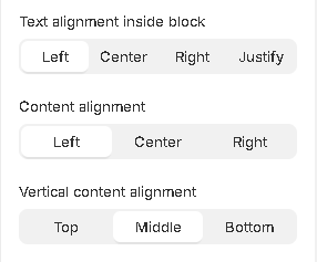
Text alignment inside block- the setting allows you to set the alignment for the text;Content alignment- the setting allows you to set the alignment for the content;Vertical content alignment- the setting allows you to set the vertical alignment for the content.
Colors
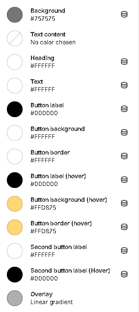
Background- the setting allows you to set the background color of the slide;Text content- the setting allows you to set the background for the text content;Heading- the setting allows you to set the color for the header;Text- the setting allows you to set the color for the text;Button label- the setting allows you to set the color for the button label;Button background- the setting allows you to set the background color for the button;Button border- the setting allows you to set the border color for the button;Button label (hover)- the setting allows you to set the color for the button label on hover;Button background (hover)- the setting allows you to set the background color for the button on hover;Button border (hover)- the setting allows you to set the border color for the button on hover;Second button label- the setting allows you to set the color for the second button label;Second button label (hover)- the setting allows you to set the color for the second button label on hover;Overlay- the setting allows you to set the color for the overlay.
Video Link Source


General
Video url (desktop)- the setting allows you to set a link to the video for the desktop;Video url (mobile)- the setting allows you to set a link to a video for the mobile;Preview image (desktop)- the setting allows you to set the image for the desktop;Preview image (mobile)- the setting allows you to set the image for the mobile;Heading- the setting allows you to set the text for the title;Text- the setting allows you to set the text for the text field;Button label- the setting allows you to set the label for the button;Button aria-label- the setting allows you to set the text for the aria-label attribute. The attribute is needed for accessibility;Button link- the setting allows you to set a link for the button;Open link in a new tab- the setting allows you to indicate how the link will open, in the current tab or the new one;Make link clickable on the entire slide- the setting allows you to make the entire slide a link;Second button label- the setting allows you to set the label for the second label;Second button aria-label- the setting allows you to set the text for the second button aria-label attribute. The attribute is needed for accessibility;Second button link- the setting allows you to set a link for the second button;Open second link in a new tab- the setting allows you to indicate how the second link will open, in the current tab or the new.
Video settings

Play type- the setting allows you to set the playback type for the video.
Alignment
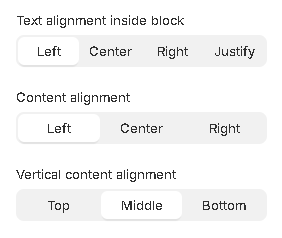
Text alignment inside block- the setting allows you to set the alignment for the text;Content alignment- the setting allows you to set the alignment for the content;Vertical content alignment- the setting allows you to set the vertical alignment for the content.
Colors

Background- the setting allows you to set the background color of the slide;Text content- the setting allows you to set the background for the text content;Heading- the setting allows you to set the color for the header;Text- the setting allows you to set the color for the text;Button label- the setting allows you to set the color for the button label;Button background- the setting allows you to set the background color for the button;Button border- the setting allows you to set the border color for the button;Button label (hover)- the setting allows you to set the color for the button label on hover;Button background (hover)- the setting allows you to set the background color for the button on hover;Button border (hover)- the setting allows you to set the border color for the button on hover;Second button label- the setting allows you to set the color for the second button label;Second button label (hover)- the setting allows you to set the color for the second button label on hover;Overlay- the setting allows you to set the color for the overlay.
Block Three-Part Slide
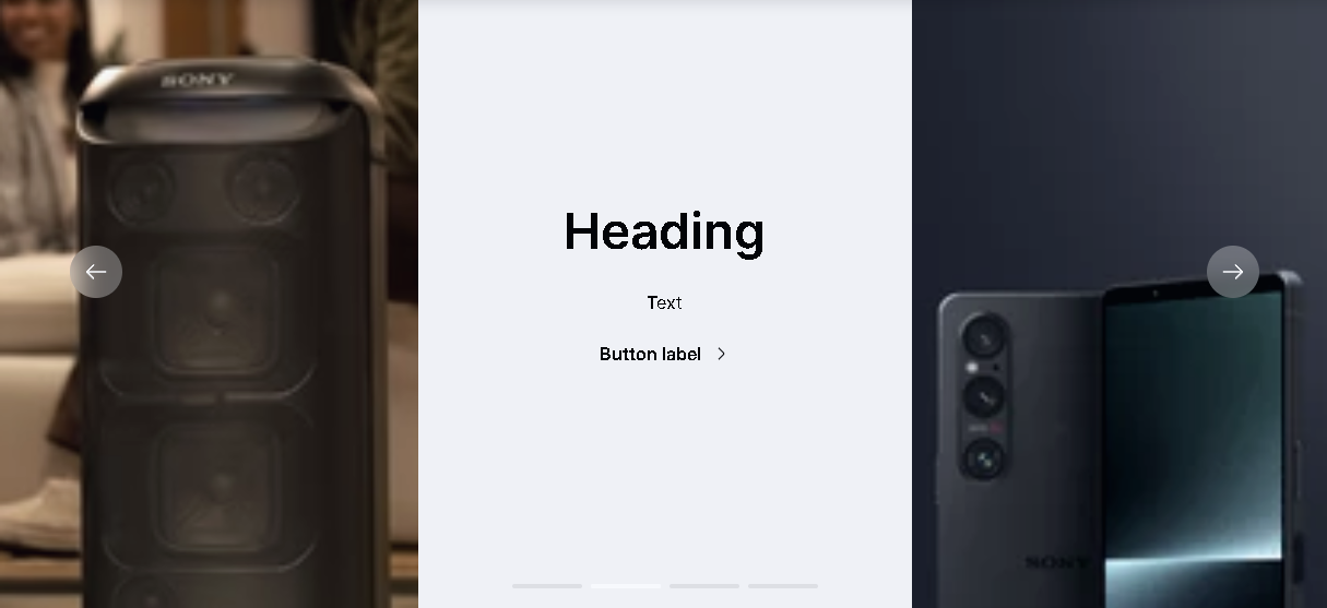
This block (slide) contains three columns. In the first and the last columns, you can set media content (Image, HTML5 video, or YouTube/Vimeo link) and in the second column, you can show the label, title, and button. You can mix media types for different columns. For example, in the first column, you can show an image and in the third column, you can show HTML 5 video.
General

Video play type- the setting allows you to set the playback type for the video.
First column

Media type- the setting allows you to select a media content type you want to show (Image, HTML 5 video, YouTube/Vimeo);Image desktop- choose the desktop image;Image mobile- choose the mobile image. If not set - the desktop image will be used;Video (desktop)- choose the HTML5 desktop video;Video (mobile)- choose the HTML5 mobile video. If not set - the desktop video will be used;YouTube/Vimeo url (desktop)- add the YouTube/Vimeo desktop video URL;YouTube/Vimeo url (mobile)- add the YouTube/Vimeo mobile video URL. If not set - the desktop video will be used;
Second column

Heading- the setting allows you to set the heading;Text- the setting allows you to set the text;Button label- the setting allows you to set the label for the button;Button aria-label- the setting allows you to set the text for the aria-label attribute. The attribute is needed for accessibility;Button link- the setting allows you to set a link for the button;Open link in a new tab- the setting allows you to indicate how the second link will open, in the current tab or the new;Make link clickable on the entire slide- the setting allows you to make the entire slide a link.
Third column

Media type- the setting allows you to select a media content type you want to show (Image, HTML 5 video, YouTube/Vimeo);Image desktop- choose the desktop image;Image mobile- choose the mobile image. If not set - the desktop image will be used;Video (desktop)- choose the HTML5 desktop video;Video (mobile)- choose the HTML5 mobile video. If not set - the desktop video will be used;YouTube/Vimeo url (desktop)- add the YouTube/Vimeo desktop video URL;YouTube/Vimeo url (mobile)- add the YouTube/Vimeo mobile video URL. If not set - the desktop video will be used;
Colors
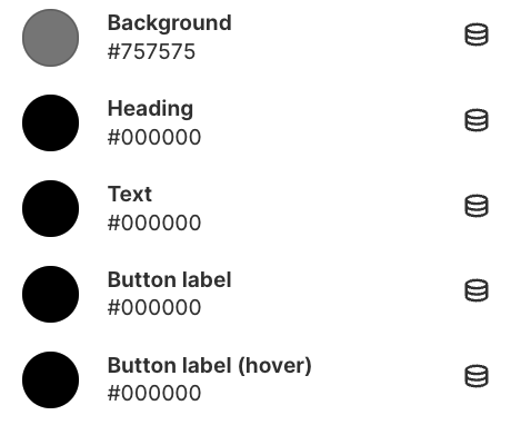
Background- the setting allows you to set the background color of the slide;Heading- the setting allows you to set the color for the header;Text- the setting allows you to set the color for the description;Button label- the setting allows you to set the color for the button label;Button label- the setting allows you to set the color for the button label when the user hovers over it.
Last updated