Collection body


On this section (located on the Collection page) customers can see products from the collection. Customers can use filters to show the products they are looking for.
Adding a Section

The section is static on the collection page template, it was added initially and cannot be removed.
Section settings
General

Filters type- setting allows choosing the view of filters: “Sidebar” or “Horizontal”. Setting works only for desktop resolution. On the mobile filters will be always in the “Drawer” view;Show grid buttons- the setting displays a certain number of cards per page. The minimum number is 12, the maximum number is 50;Show color swatch in filters- if checked, the filter group with name, specified in the Theme settings / Product / Swatch option ("Color" by default) will show a checkbox like color swatch;
Disble lazy-load- the setting is responsible for disabling lazy-load for the first two products. Use this if you hide the collection image banner;Paginate by- the setting is responsible for displaying a certain number of cards per page. The minimum number is 12, the maximum number is 50;Pagination type- the setting is responsible for the type of loading of product cards. Can be “Pagination”, “Load more”, or “Infinity scrolling”.
Blocks settings

Layout

Container width- a container width of the section. If the “Inherit” value is selected then the container width is based on the group 'Layout' settings in the Theme settings;Desktop offset top- the top indent of the section on the desktop;Desktop offset bottom- the bottom indent of the section on the desktop;Mobile offset top- the top indent of the section on the mobile;Mobile offset bottom- the bottom indent of the section on the mobile.
General

Image- the setting is responsible for the banner image;Heading- the setting is responsible for the banner heading;Button label- the setting is responsible for the banner button label;Button link- the setting is responsible for the banner button url.
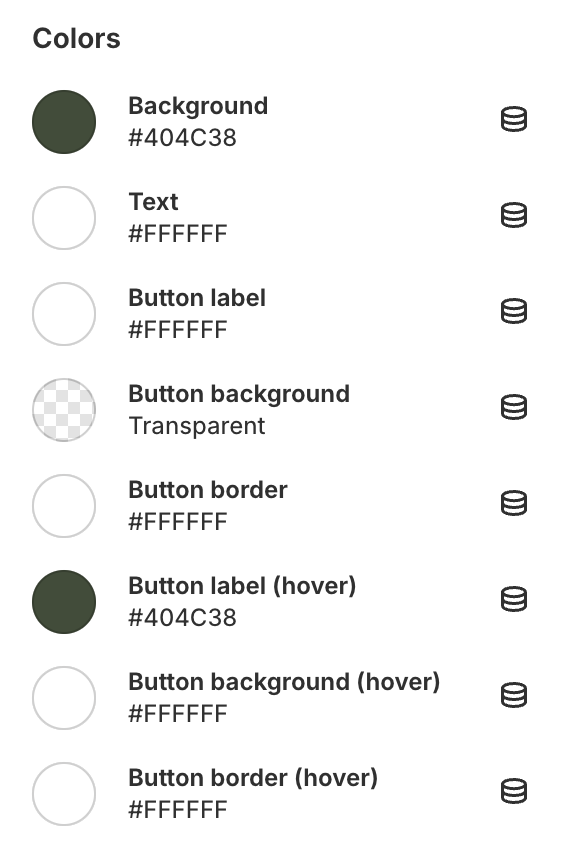
Colors

Background- the setting is responsible for the banner background color;Text- the setting is responsible for the banner text color;Button label- the setting is responsible for the banner label color;Button background- the setting is responsible for the banner button background color;Button border- the setting is responsible for the banner button border color;Button label (hover)- the setting is responsible for the banner button label color on hover;Button background (hover)- the setting is responsible for the banner button background on hover;Button border (hover)- the setting is responsible for the banner button border color on hover.
Additional information
Shopify Filtering Tutorial: https://help.shopify.com/en/manual/online-store/themes/customizing-themes/storefront-filters