> For the complete documentation index, see [llms.txt](https://utd-bv.gitbook.io/manual-shopify-theme-ultra/llms.txt). Markdown versions of documentation pages are available by appending `.md` to page URLs; this page is available as [Markdown](https://utd-bv.gitbook.io/manual-shopify-theme-ultra/ultra-sections/sections-and-snippets/mini-banner.md).
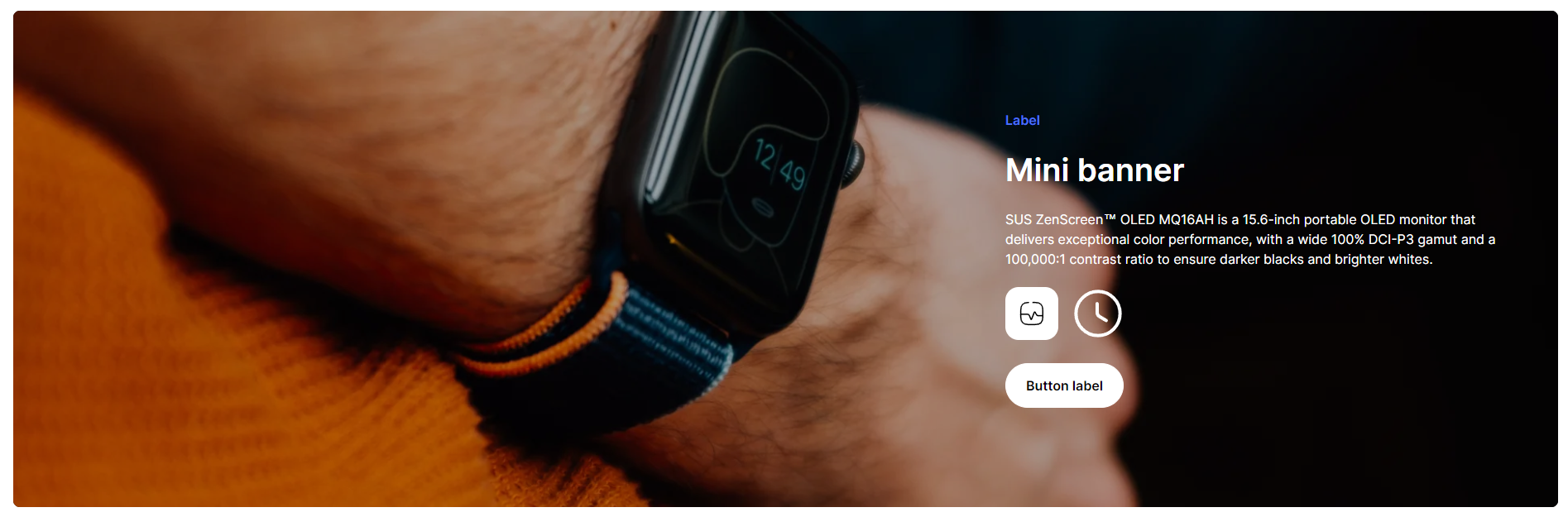
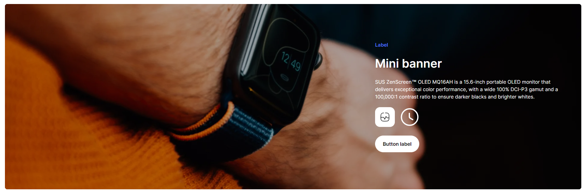
# Mini banner
## **Adding a Section**
## **Adding a Section**
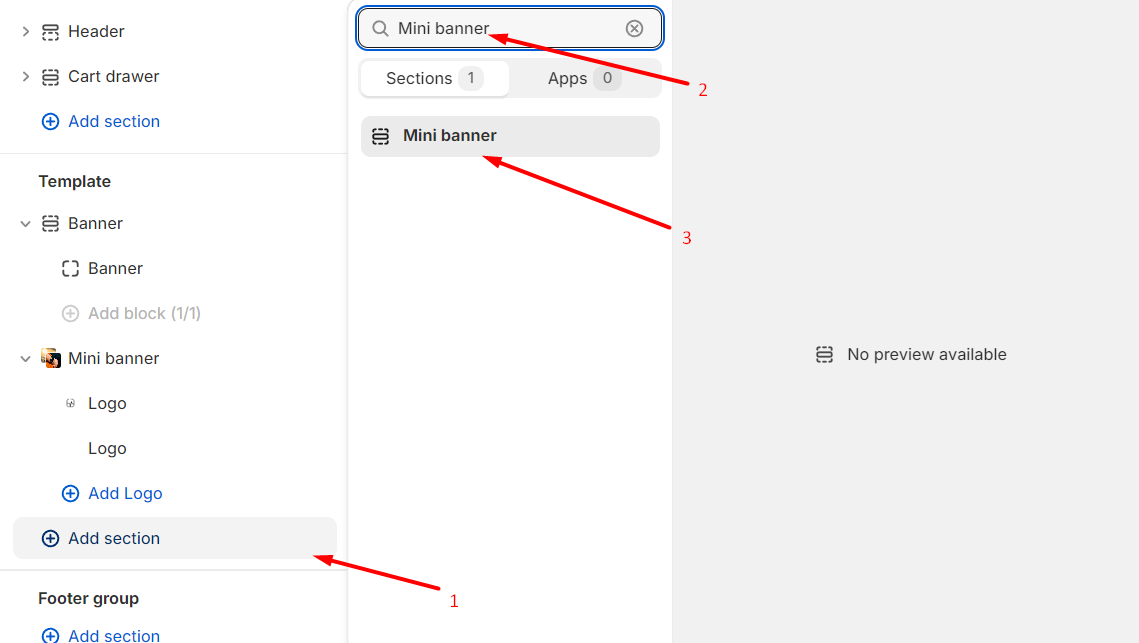
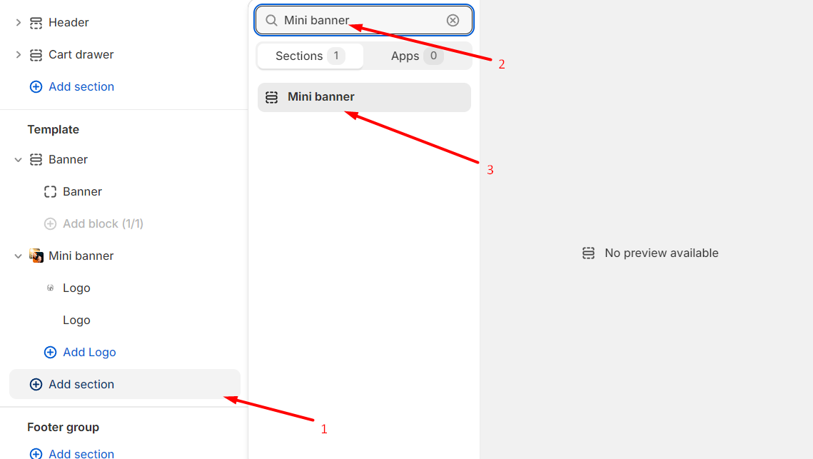
In order to add a section, you need to go to **`Customizer`** → **`Add Section`** → **`Mini banner`**.
## **Section settings**
### **General**
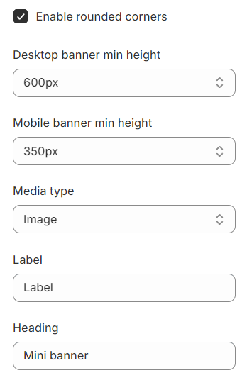
1. **`Enable rounded corners`** - you can specify rounded corners for the section and indents on the sides;
2. **`Desktop banner min height`** - set a minimum height for the banner on the desktop;
3. **`Mobile banner min height`** - set a minimum height for the banner on the mobile;
4. **`Media type`** - selector for choosing the type of media content to be displayed. Available types are:
* **`Image`** - a normal image will be displayed;
* **`HTML5 video`** - **HTML5** video will be displayed;
* **`Youtube/Vimeo`** - a video from the **YouTube** or **Vimeo** platform will be displayed.
5. **`Label`** - field for **Label**;
6. **`Heading`** - field for **Heading**;
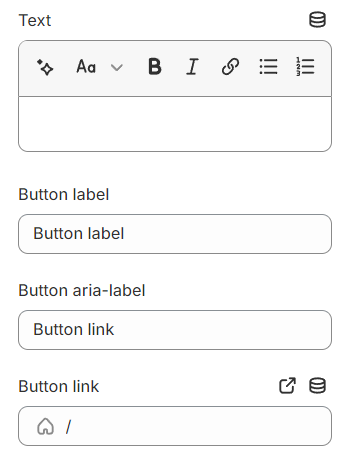
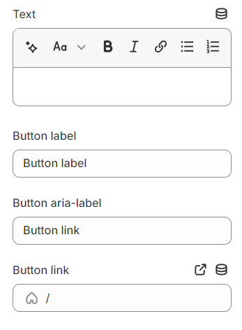
7. **`Text`** - field for **Text**;
8. **`Button label`** - a field for the label content of the button;
9. **`Button aria-label`** - field for **aria-label**, this field is needed to improve **accessibility**, people using **screen readers** will hear the purpose of this button;
10. **`Button link`** - the **URL** field for the button;
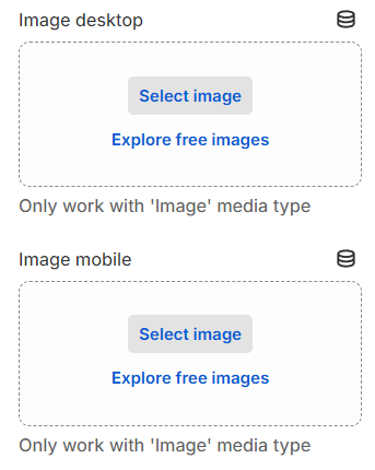
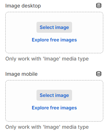
11. **`Image desktop`** - you can set a picture for the desktop;
12. **`Image mobile`** - can set mobile image, if not selected will be desktop image;
### Video
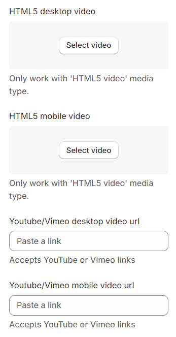
1. **`HTML5 desktop video`** - you can choose a video for your desktop, only work with 'HTML5 video' media type;
2. **`HTML5 mobile video`** - you can choose a video for your mobile, by default, there will be a picture from the desktop, only work with 'HTML5 video' media type;
3. **`Youtube/Vimeo desktop video url`** - you can set YouTube/Vimeo video URL for desktop, only work with "YouTube/Vimeo video" media type;
4. **`Youtube/Vimeo mobile video url`** - you can set YouTube/Vimeo video URL for mobile, by default, there will be a picture from the desktop, only work with "YouTube/Vimeo video" media type;
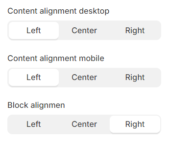
### **Alignment**
1. **`Content alignment desktop`** - content position selector within the block. Text can have 3 positions:
* **`Left`** - content positioning on the left side;
* **`Center`** - positioning content in the center;
* **`Right`** - positioning content on the right side;
2. **`Content alignment mobile`** - content position selector within the block on the mobile. Text can have 3 positions:
* **`Left`** - content positioning on the left side;
* **`Center`** - positioning content in the center;
* **`Right`** - positioning content on the right side;
3. **`Block alignment`** - block position selector. A block can have 3 positions.
* **`Left`** - block’s positioning on the left side of the container;
* **`Center`** - block’s positioning in the center of the container;
* **`Right`** - block’s positioning on the right side of the container.
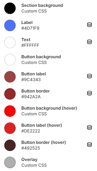
### Color
1. **`Section beckground`** - you can set the background for the section;
2. **`Label`** - you can set the color for the label;
3. **`Text`** - you can set the color for the text;
4. **`Button background`** - you can set the background for the button;
5. **`Button label`** - you can set the color for the button label;
6. **`Button border`** - you can set the color for the button border;
7. **`Button background (hover)`** - you can set the background for the button on hover;
8. **`Button label (hover)`** - you can set the color for the button label on hover;
9. **`Button border (hover)`** - you can set the color for the button border on hover;
10. **`Overlay`** - you can set the color for the overlay;
## Blocks settings
### Logo
1. **`Image`** - you can set a picture for the Logo;