> For the complete documentation index, see [llms.txt](https://utd-bv.gitbook.io/manual-shopify-theme-ultra/llms.txt). Markdown versions of documentation pages are available by appending `.md` to page URLs; this page is available as [Markdown](https://utd-bv.gitbook.io/manual-shopify-theme-ultra/ultra-sections/sections-and-snippets/featured-products.md).
# Featured products
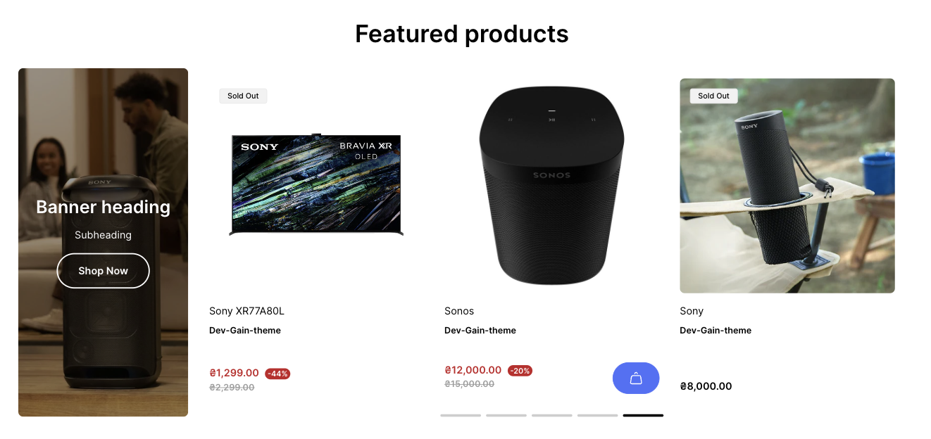
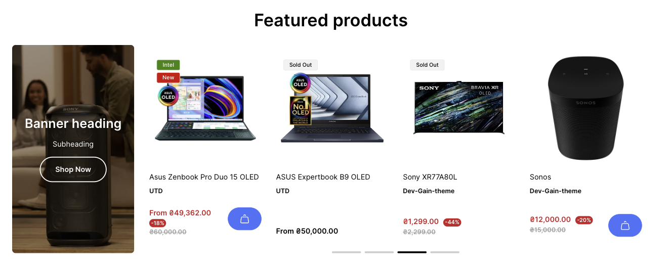
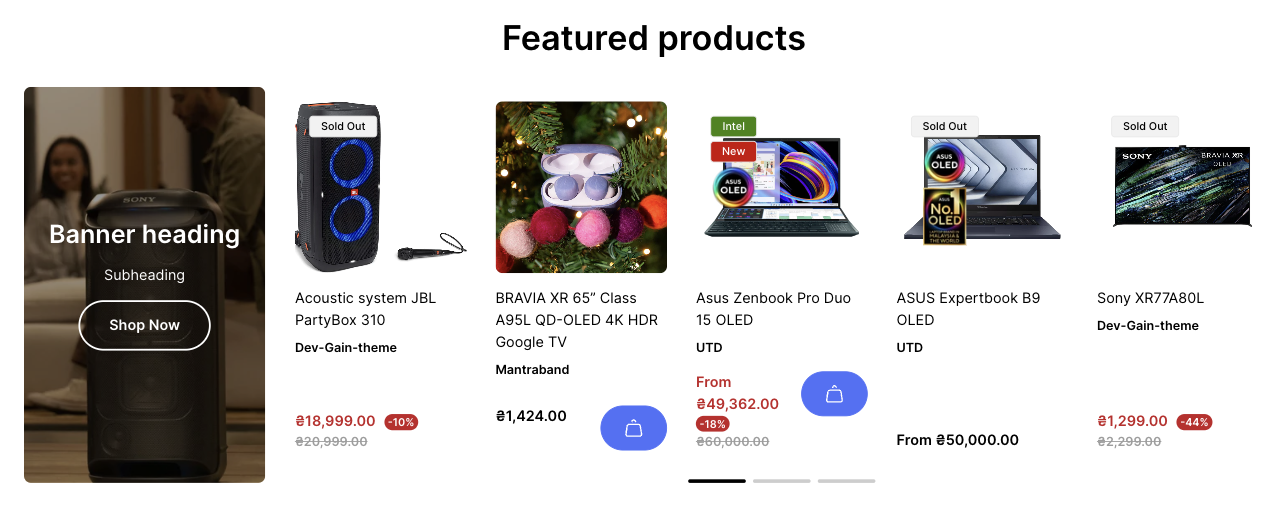
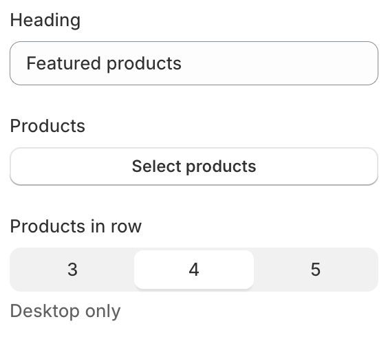
In this section, you can show products in a slideshow for your customers. You can change the count of products per row: 3, 4 or 5.
## **Adding a section**
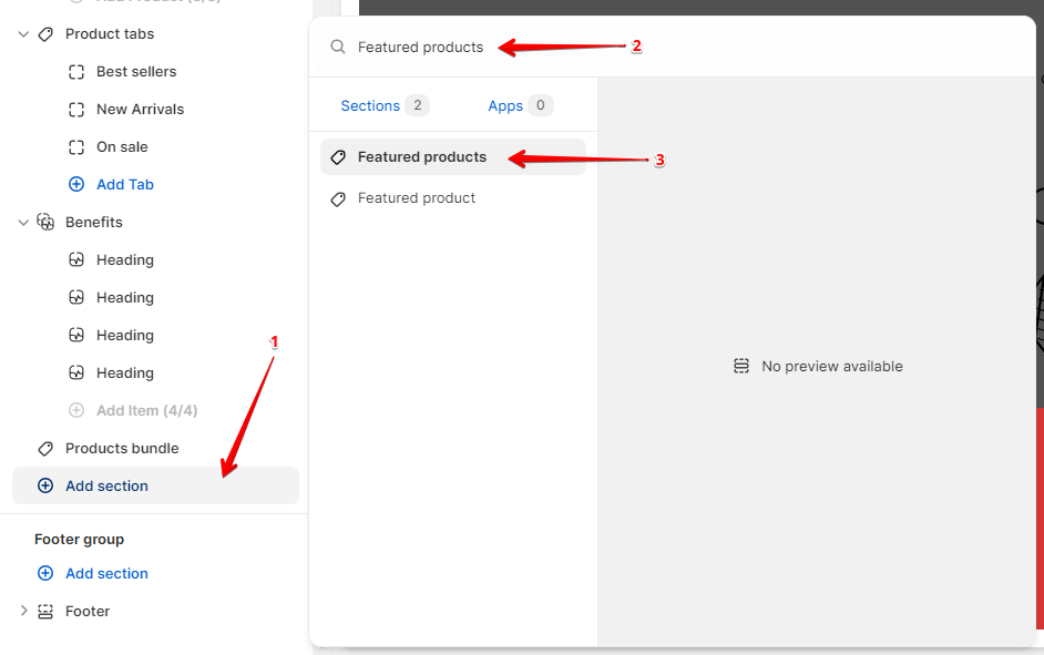
In order to add a section, you need to go to **`Customizer`** → **`Add Section`** → **`Featured products`**.
## **Section settings**
### General
1. **`Heading`** - the setting allows you to add a section title;
2. **`Products`** - the setting is responsible for selecting products to display. **Limit: 12 products**;
3. **`Layout`** - setting allows you to change the number of displayed cards on the **Desktop**. The values are 3, 4, 5;
### Banner
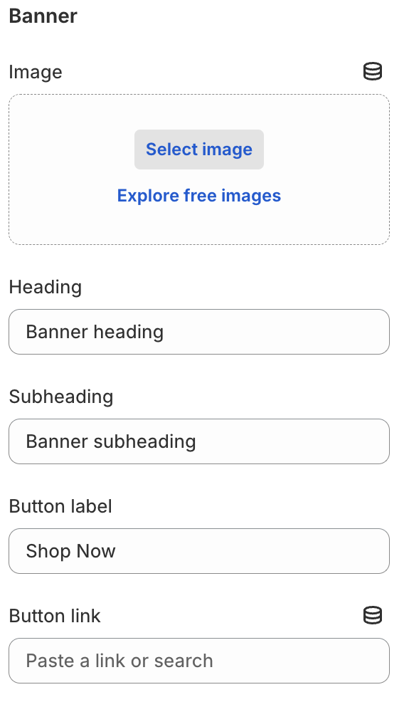
1. **`Image`** - the setting allows you to add an image to the banner;
2. **`Heading`** - the setting allows you to add heading text to the banner;
3. **`Subheading`** - the setting allows you to add subheading text to the banner;
4. **`Button label`** - the setting allows you to add a button text (required for displaying the button);
5. **`Button link`** - the setting allows you to add a button link (required for displaying the button);
### Colors
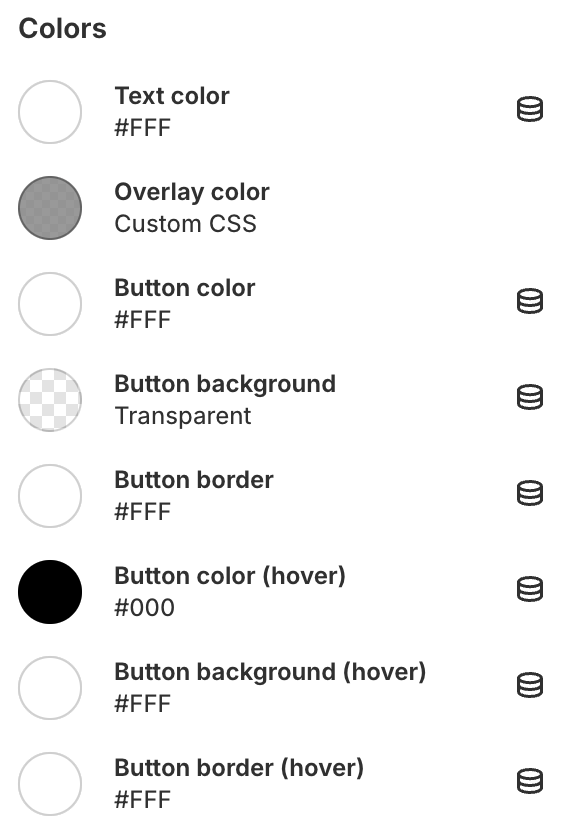
1. **`Text color`** - the setting allows you to set the color for the text;
2. **`Overlay color`** - the setting allows you to set the color for overlaying the background for the banner;
3. **`Button color`** - the setting allows you to set the color for the button text;
4. **`Button background`** - the setting allows you to set the color for the button background;
5. **`Button border`** - the setting allows you to set the color for the button border;
6. **`Button color (hover)`** - the setting allows you to set the color for the button text on hover;
7. **`Button background (hover)`** - the setting allows you to set the color for the button background on hover;
8. **`Button border (hover)`** - the setting allows you to set the color for the button border on hover;
### Layout
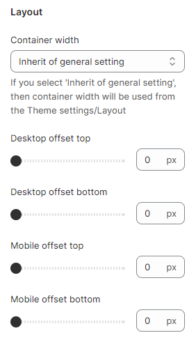
1. **`Container width`** - a container width of the section. If the “Inherit” value is selected then the container width is based on the group 'Layout' settings in the Theme settings;
2. **`Desktop offset top`** - the **top** indent of the section on the **desktop**;
3. **`Desktop offset bottom`** - the **bottom** indent of the section on the **desktop**;
4. **`Mobile offset top`** - the **top** indent of the section on the **mobile**;
5. **`Mobile offset bottom`** - the **bottom** indent of the section on the **mobile**.