> For the complete documentation index, see [llms.txt](https://utd-bv.gitbook.io/manual-shopify-theme-ultra/llms.txt). Markdown versions of documentation pages are available by appending `.md` to page URLs; this page is available as [Markdown](https://utd-bv.gitbook.io/manual-shopify-theme-ultra/ultra-sections/sections-and-snippets/promo-image.md).
# Promo image
## **Adding a Section**
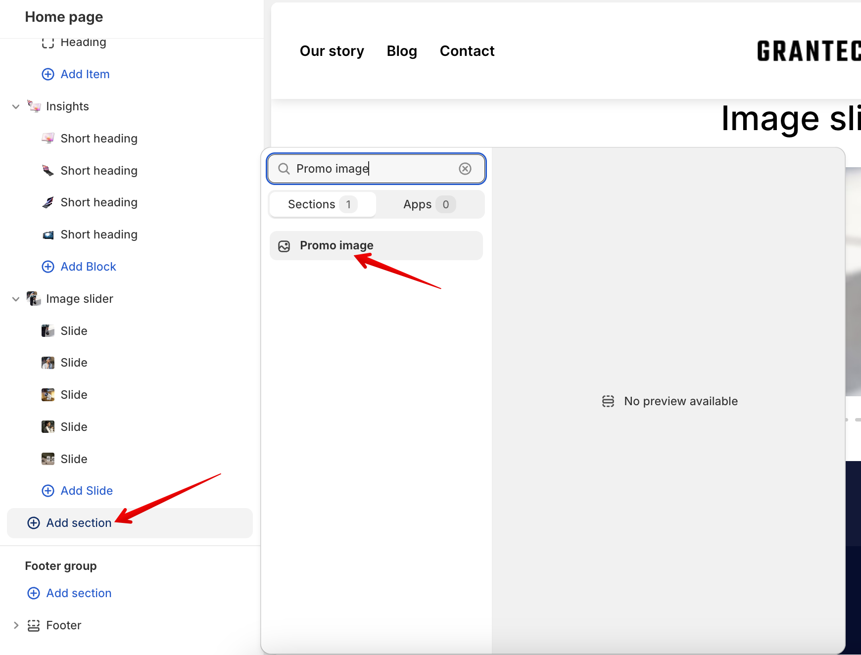
**`Customizer`** → **`Add Section`** → **`Promo image`**.
## **Section settings**
### General
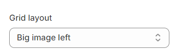
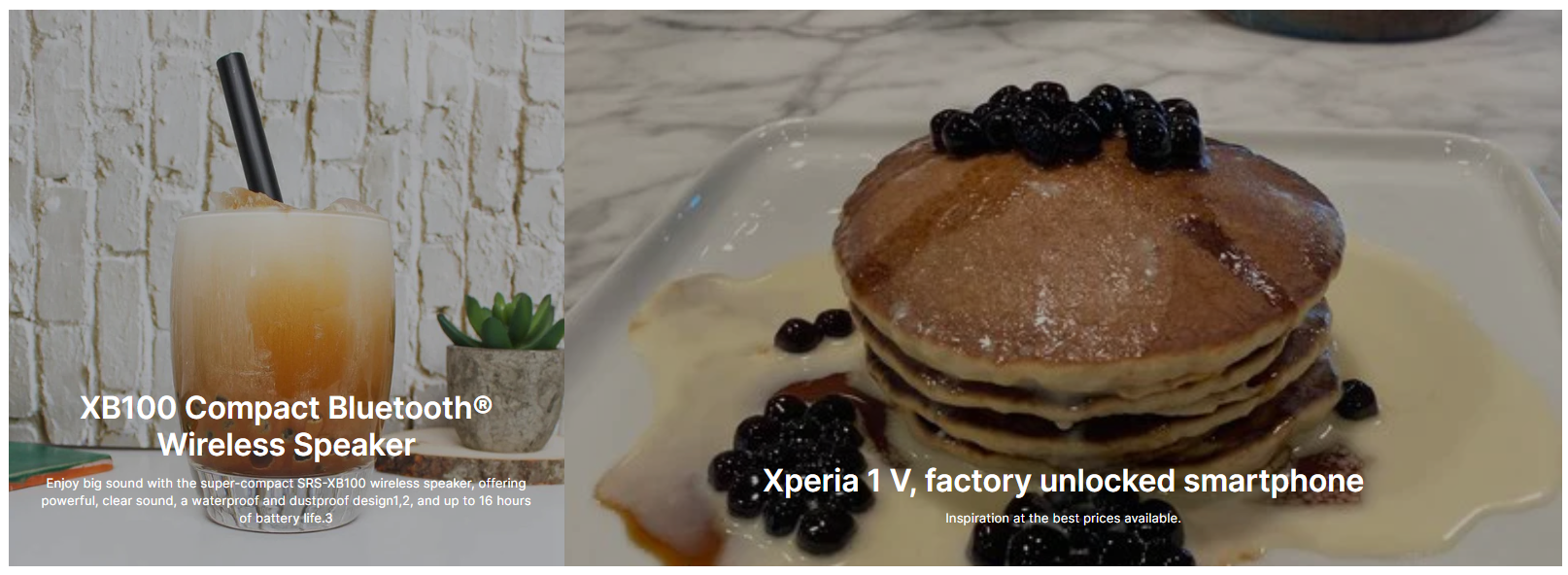
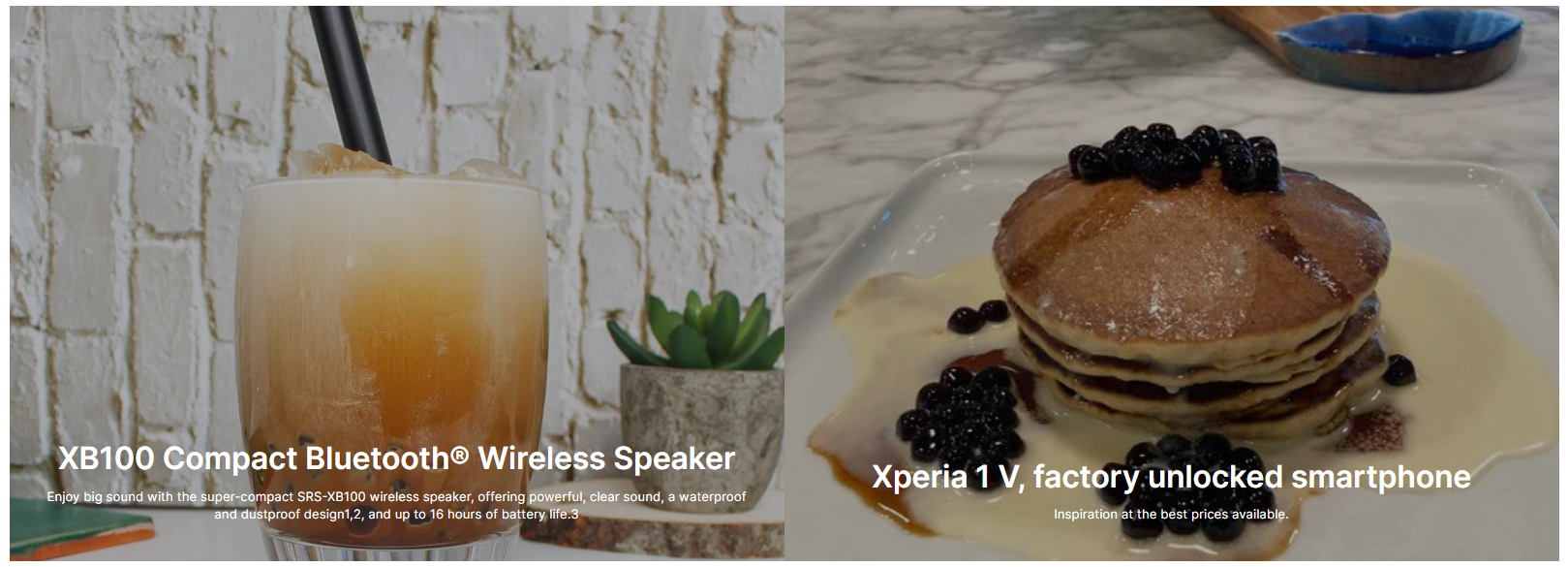
1. **`Grid layout`** - the setting is responsible for the location of a larger image or for the images to be the same;
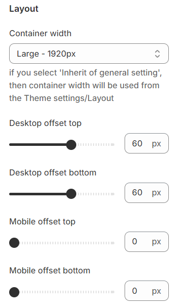
### Layout
1. **`Container width`** - a container width of the section. If the “Inherit” value is selected then the container width is based on the group 'Layout' settings in the Theme settings;
2. **`Desktop offset top`** - the **top** indent of the section on the **desktop**;
3. **`Desktop offset bottom`** - the **bottom** indent of the section on the **desktop**;
4. **`Mobile offset top`** - the **top** indent of the section on the **mobile**;
5. **`Mobile offset bottom`** - the **bottom** indent of the section on the **mobile**.
## **Blocks settings**
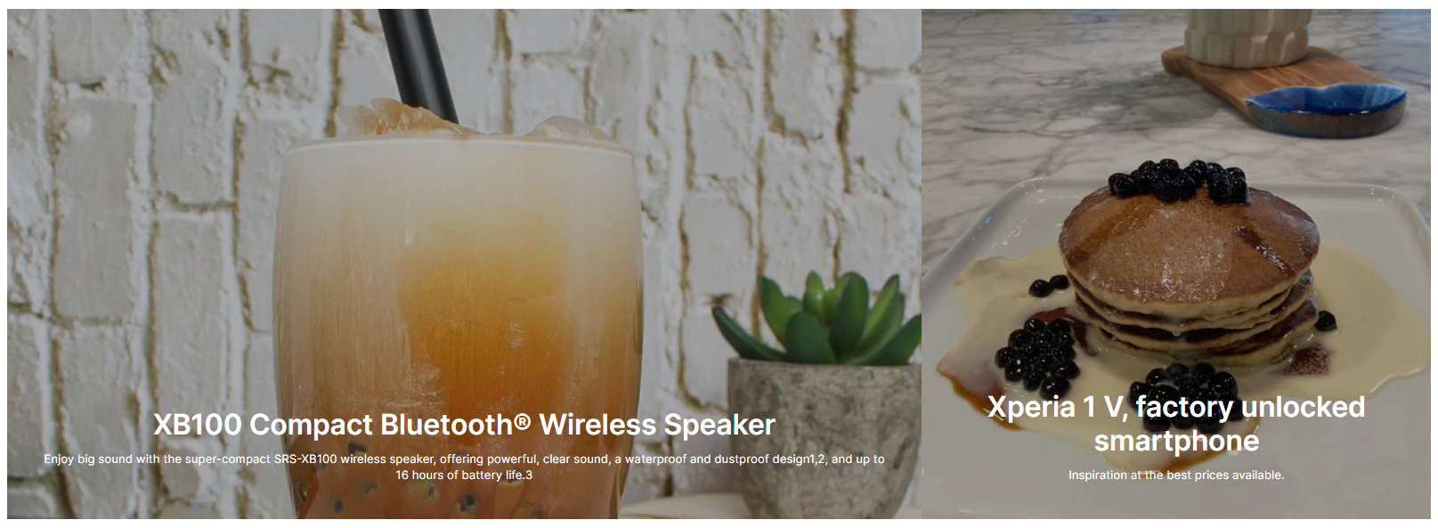
### Grid image
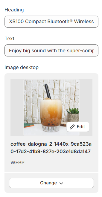
1. **`Heading`** - you can set a title for the block;
2. **`Text`** - you can set a text for the block;
3. **`Image desktop`** - you can set a picture for the desktop;
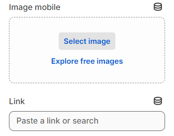
4. **`Image mobile`** - you can set a picture for mobile extensions, if the picture is not set it will be used on the desktop;
5. **`Link`** - you can set the link for the block;
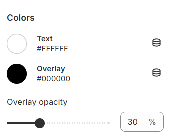
**Colors**
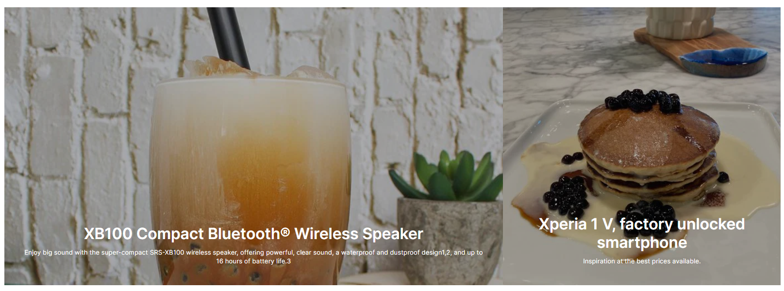
1. **`Text`** - you can set the color for the text.;
2. **`Overlay`** - you can set the color for the Overlay;
3. **`Overlay opacity`** - you can set transparency for the Overlay.
## **Additional Information**
1. A section can have a maximum of 2 blocks.
2. If a section uses one block, then the block image is automatically stretched to the full width of the section.