> For the complete documentation index, see [llms.txt](https://utd-bv.gitbook.io/manual-shopify-theme-ultra/llms.txt). Markdown versions of documentation pages are available by appending `.md` to page URLs; this page is available as [Markdown](https://utd-bv.gitbook.io/manual-shopify-theme-ultra/ultra-sections/sections-and-snippets/blog-posts.md).
# Blog posts
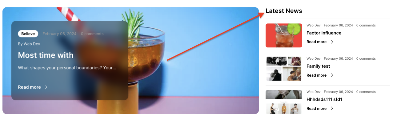
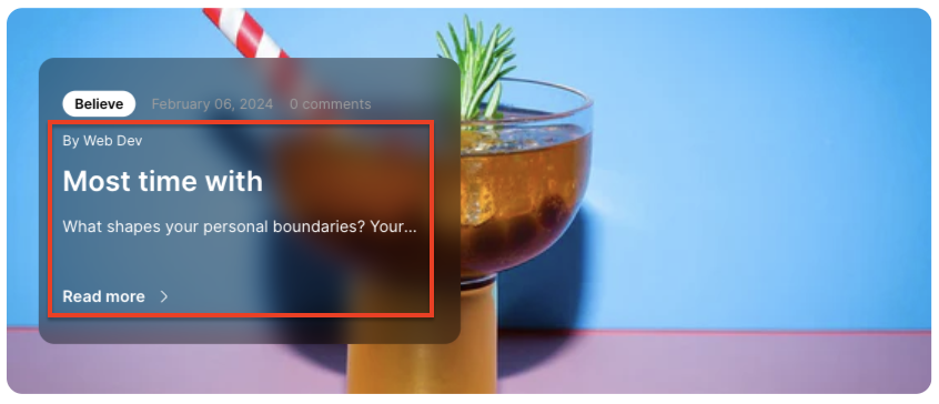
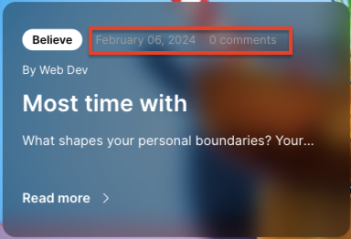
In this section, you can display a list of the last four blogs.
Desktop:
Mobile:
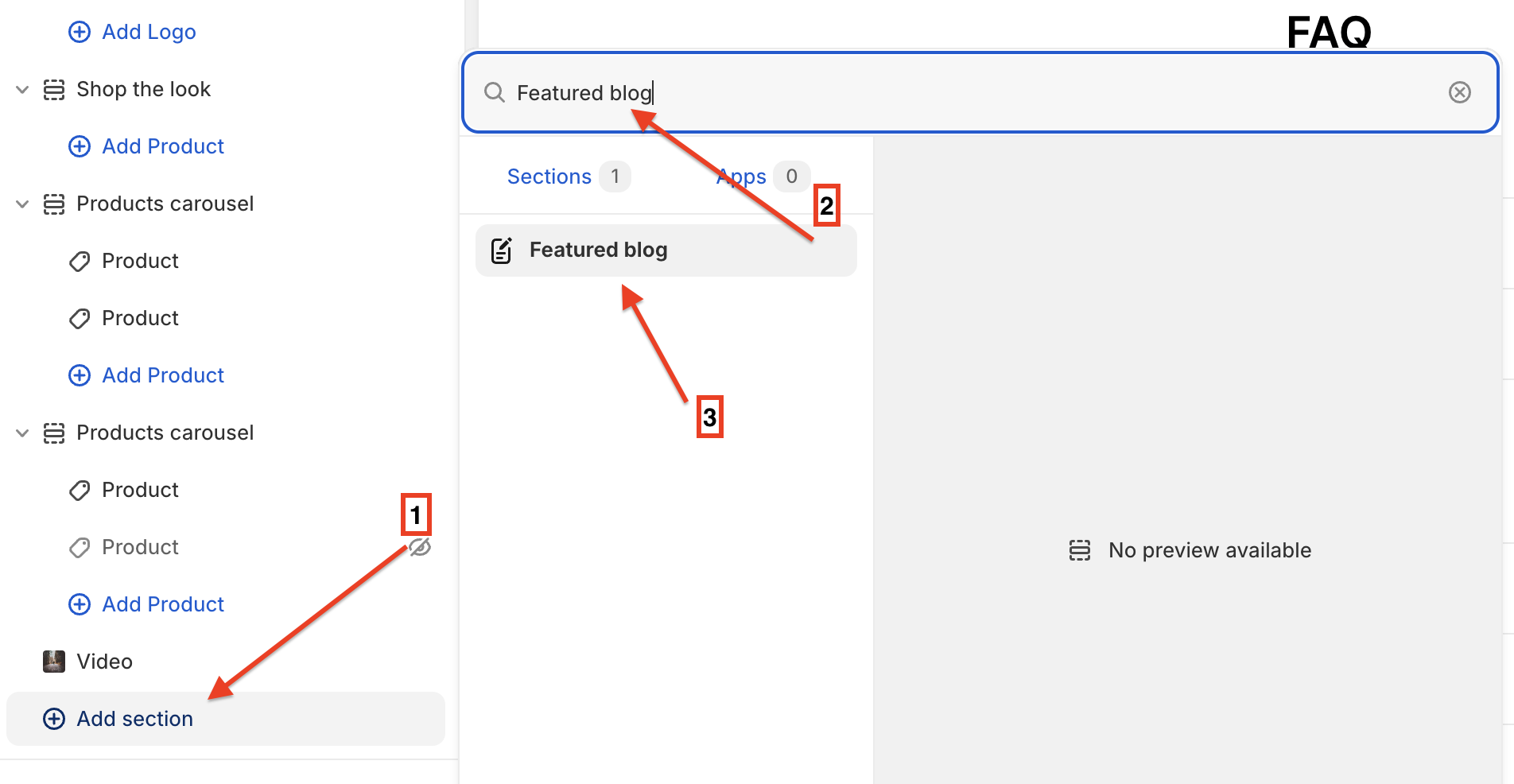
## **Adding a section**
In order to add a section, you need to go to:
**`Customizer`** → **`Add Section`** → **`Featured blog`**.
## **Section settings**
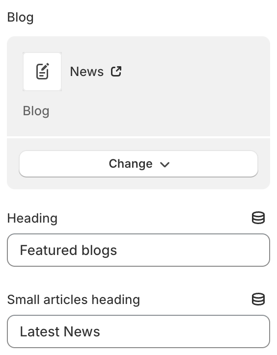
### General
1. **`Blog`** - you can choose the blog you want;
2. **`Heading`** - a field where you can specify a title for the section;
3. **`Small articles heading`** - a field where you can set the heading for a small section with blogs;
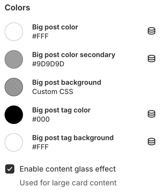
### Colors
1. **`Big post color`** - text color in the big post block;
1. **`Blog post color secondary` -** text color for the text with basic data about the article;
1. **`Big post background`** - background color for big post;
2. **`Big post tag color`** - color for the tag text;
3. **`Big post background`** - background color for the tag;
4. **`Enable content glass effect`** - enable the glass effect for a big post background;
### Layout
1. **`Container width`** - a container width of the section. If “Inherit” value is selected then container width based on the group 'Layout' settings in the Theme settings;
2. **`Desktop offset top`** - the **top** indent of the section on the **desktop**;
3. **`Desktop offset bottom`** - the **bottom** indent of the section on the **desktop**;
4. **`Mobile offset top`** - the **top** indent of the section on the **mobile**;
5. **`Mobile offset bottom`** - the **bottom** indent of the section on the **mobile**.
.png)