> For the complete documentation index, see [llms.txt](https://utd-bv.gitbook.io/manual-shopify-theme-ultra/llms.txt). Markdown versions of documentation pages are available by appending `.md` to page URLs; this page is available as [Markdown](https://utd-bv.gitbook.io/manual-shopify-theme-ultra/ultra-sections/sections-and-snippets/general-banner.md).
# General Banner
The General Banner section is a versatile promotional tool for your store. You can display a bold banner featuring an image or a video to capture attention and highlight key messages. It’s ideal for showcasing special announcements, new collections, or limited-time offers.
Additionally, this section includes an optional countdown timer—perfect for creating urgency during sales or product launches. With customizable visuals and messaging, the General Banner helps you engage customers and drive action right from the storefront.
## **Adding a Section**
In order to add a section, you need to go to **`Customizer`** → **`Add Section`** → **`General Banner`**.
## **Section settings**
1. **`Enable rounded corners`** - the setting allows you to add rounded corners for the container;
### Colors
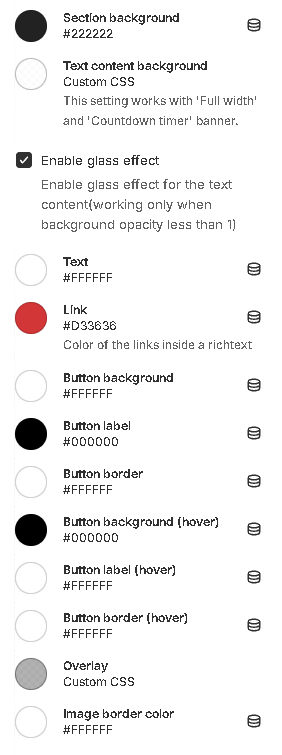
1. **`Section background`** - background color setting;
2. **`Text content background`** - background color for the content;
3. **`Enable glass effect`** - the setting allows you to add glass effect for the text content background;
4. **`Text`** - text color setting;
5. **`Link`** - \*\*\*\*setting link text color;
6. **`Button background`** - setting the background color of the button;
7. **`Button label`** - setting button label color;
8. **`Button border`** - setting the color of the button border;
9. **`Button background (hover)`** - setting the background color of the button on hover;
10. **`Button text (hover)`** - setting button label color on hover;
11. **`Button border (hover)`** - setting the button border color on hover.
12. **`Overlay`** - overlay color for media content;
13. **`Image border color`** - the color of the border that can be added to the media content;
### Layout
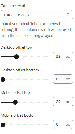
1. **`Container width`** - a container width of the section. If the “Inherit” value is selected then the container width is based on the group 'Layout' settings in the Theme settings;
2. **`Desktop offset top`** - the **top** indent of the section on the **desktop**;
3. **`Desktop offset bottom`** - the **bottom** indent of the section on the **desktop**;
4. **`Mobile offset top`** - the **top** indent of the section on the **mobile**;
5. **`Mobile offset bottom`** - the **bottom** indent of the section on the **mobile**.
## **Blocks settings**
**Block limit** - `1`
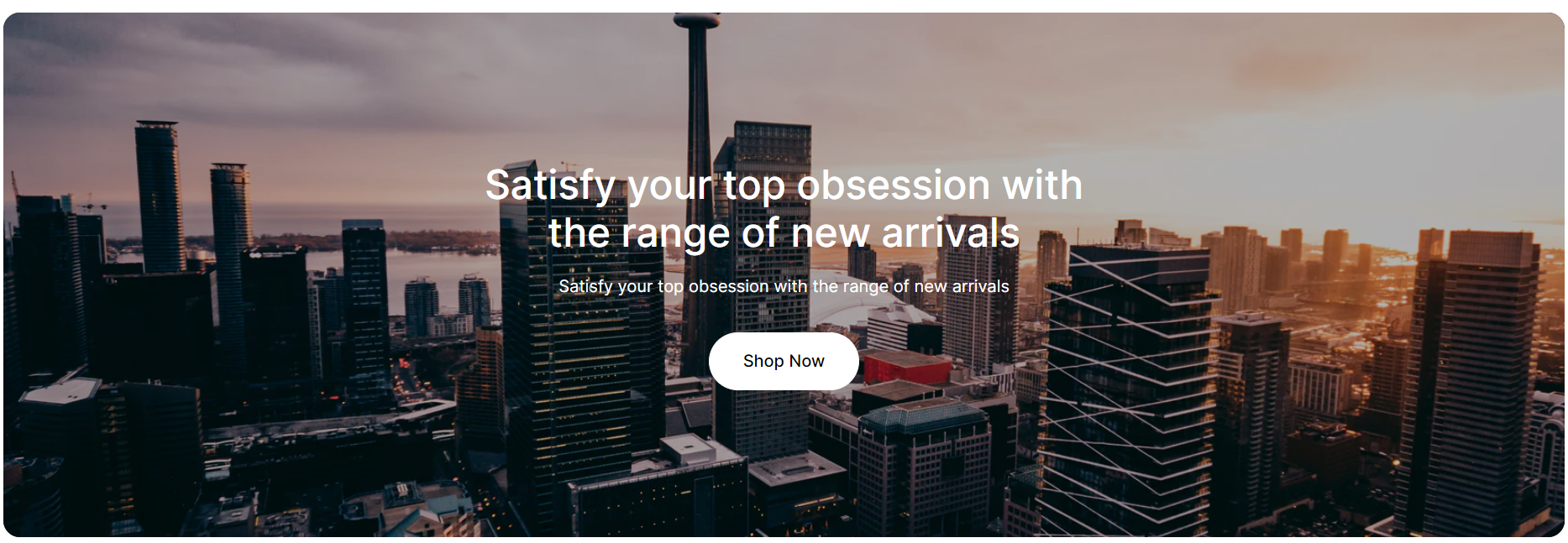
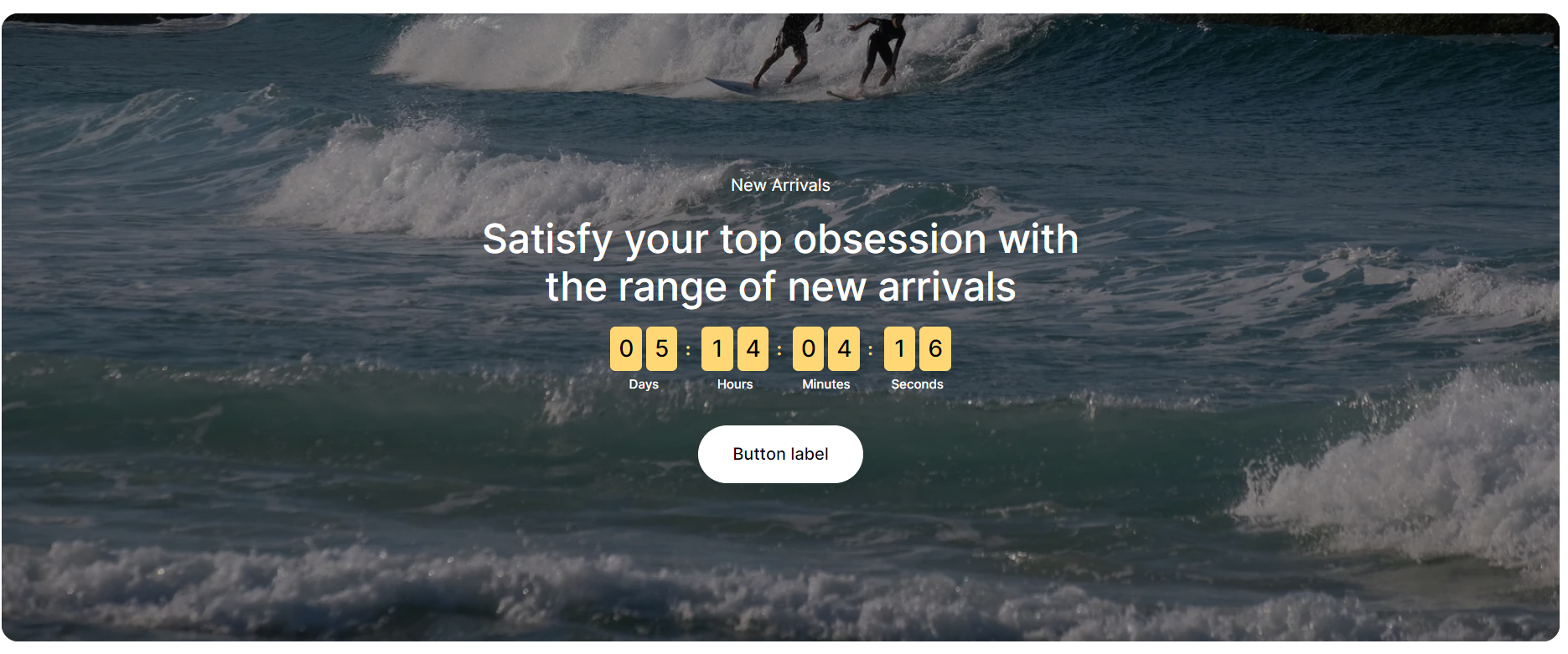
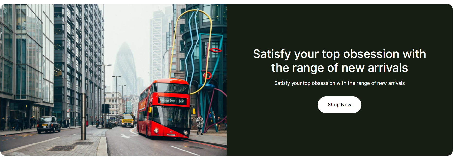
The section contains three different types of blocks (banner options): `Full-width`, `Countdown timer`, and `Two columns`.
### **Block Wide Media**
### General
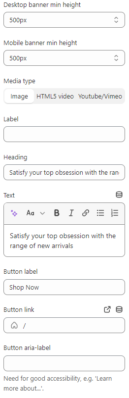
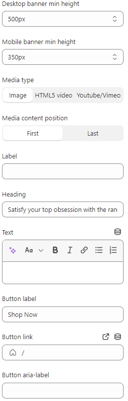
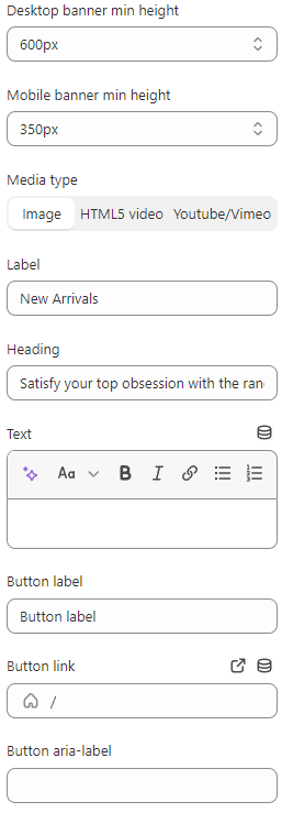
1. **`Desktop banner min height`** - set a minimum height for the banner on the desktop;
2. **`Mobile banner min height`** - set a minimum height for the banner on the mobile;
3. **`Media type`** - selector for choosing the type of media content to be displayed. Available types are:
* **`Image`** - a normal image will be displayed;
* **`HTML5 video`** - **HTML5** video will be displayed;
* **`Youtube/Vimeo`** - a video from the **YouTube** or **Vimeo** platform will be displayed.
4. **`Label`** - field for **Label**;
5. **`Heading`** - field for **Heading**;
6. **`Text`** - field for **Text**;
7. **`Button label`** - a field for the label content of the button;
8. **`Button link`** - the **URL** field for the button;
9. **`Button aria-label`** - field for **aria-label**, this field is needed to improve **accessibility**, people using **screen readers** will hear the purpose of this button;
10. **`Overlay opacity`** - **overlay** transparency adjustment;
11. **`Overlay color`** - setting allows you to select the color of the overlay;
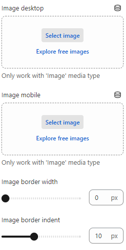
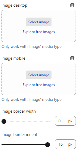
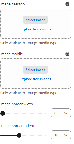
12. **`Image desktop`** - choose a picture to be displayed on the **Desktop**;
13. **`Image mobile`** - choose a picture to be displayed on the **Mobile**;
14. **`Image border width`** - the setting allows you to set the size of the border;
15. **`Image border indent`** - the setting allows you to set the indent of the border;
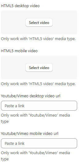
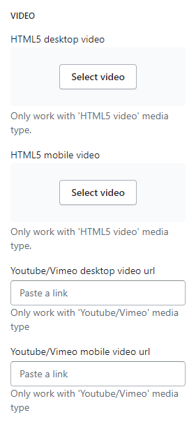
### Video
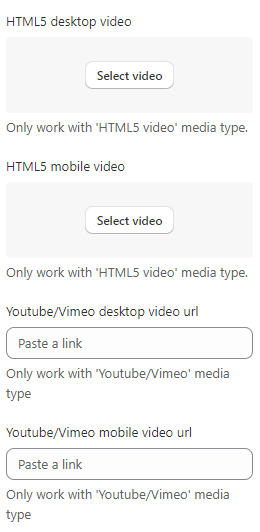
1. **`HTML5 Desktop Video`** - a field to add an **HTML5** Video to be displayed on the **Desktop**;
2. **`HTML5 Mobile Video`** - a field to add an **HTML5** Video to be displayed on the **Mobile**;
3. **`Youtube/Vimeo Desktop Video Url`** - a field for adding a link to **YouTube** or **Vimeo** video to be displayed on the **Desktop**;
4. **`Youtube/Vimeo Mobile Video Url`** - a field for adding a link to **YouTube** or **Vimeo** video to be displayed on the **Mobile**.
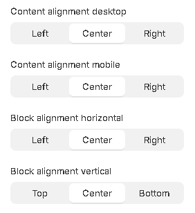
### Alignment
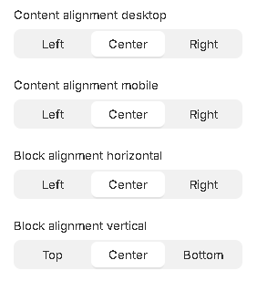
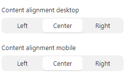
1. **`Content alignment`** - content position selector within the block. Text can have 3 positions:
* **`Left`** - content positioning on the left side;
* **`Center`** - positioning content in the center;
* **`Right`** - positioning content on the right side;
2. **`Content alignment mobile`** - content position selector within the block on the mobile. Text can have 3 positions:
* **`Left`** - content positioning on the left side;
* **`Center`** - positioning content in the center;
* **`Right`** - positioning content on the right side;
3. **`Block alignment horizontal`** - block horizontal position selector. A block can have 3 positions.
* **`Left`** - block’s positioning on the left side of the container;
* **`Center`** - block’s positioning in the center of the container;
* **`Right`** - block’s positioning on the right side of the container.
4. **`Block alignment vertical`** - block vertical position selector. A block can have 3 positions.
* **`Top`** - block’s positioning on the top side of the container;
* **`Center`** - block’s positioning in the center of the container;
* **`Bottom`** - block’s positioning on the bottom side of the container.
### Block Side-by-Side
### General
1. **`Desktop banner min height`** - set a minimum height for the banner on the desktop;
2. **`Mobile banner min height`** - set a minimum height for the banner on the mobile;
3. **`Media type`** - selector for choosing the type of media content to be displayed. Available types are:
* **`Image`** - a normal image will be displayed;
* **`HTML5 video`** - **HTML5** video will be displayed;
* **`Youtube/Vimeo`** - a video from the **YouTube** or **Vimeo** platform will be displayed;
1. **`Media content position`** - image position selector. There are two options:
* **`First`** - the image will be placed before the text block;
* **`Last`** - the image will be placed after the text block;
2. **`Label`** - field for **Label**;
3. **`Heading`** - field for **Heading**;
4. **`Text`** - field for **Text**;
5. **`Button label`** - a field for the label content of the button;
6. **`Button link`** - the **URL** field for the button;
7. **`Button aria-label`** - field for **aria-label**, this field is needed to improve **accessibility**, people using **screen readers** will hear the purpose of this button;
8. **`Image desktop`** - picker picture displayed on **Desktop**;
9. **`Image mobile`** - picker picture displayed on **Mobile**.
10. **`Image border width`** - the setting allows you to set the size of the border on the image;
11. **`Image border indent`** - the setting allows you to set the indent of the border on the image;
### Video
1. **`HTML5 Desktop Video Url`** - a field to add an **HTML5** Video to be displayed on the **Desktop**;
2. **`HTML5 Mobile Video Url`** - a field to add an **HTML5** Video to be displayed on the **Mobile**;
3. **`Youtube/Vimeo Desktop Video Url`** - a field for adding a link to **YouTube** or **Vimeo** video to be displayed on the **Desktop**;
4. **`Youtube/Vimeo Mobile Video Url`** - field to add a link to **Youtube** or **Vimeo** video to be displayed on the **Mobile**.
### Alignment
1. **`Content alignment`** - content position selector within the block. Text can have 3 positions:
* **`Left`** - content positioning on the left side;
* **`Center`** - positioning content in the center;
* **`Right`** - positioning content on the right side;
2. **`Content alignment mobile`** - content position selector within the block on mobile. Text can have 3 positions:
* **`Left`** - content positioning on the left side;
* **`Center`** - positioning content in the center;
* **`Right`** - positioning content on the right side;
### **Block** Sale Timer
### General
1. **`Desktop banner min height`** - set a minimum height for the banner on the desktop;
2. **`Mobile banner min height`** - set a minimum height for the banner on the mobile;
3. **`Media type`** - selector for choosing the type of media content to be displayed. Available types are:
* **`Image`** - a normal image will be displayed;
* **`HTML5 video`** - **HTML5** video will be displayed;
* **`Youtube/Vimeo`** - a video from the **YouTube** or **Vimeo** platform will be displayed;
4. **`Label`** - field for **Label**;
5. **`Heading`** - field for **Heading**;
6. **`Text`** - field for **Text**;
7. **`Button label`** - a field for the text content of the button;
8. **`Button link`** - the **URL** field for the button;
9. **`Button aria-label`** - field for **aria-label**, this field is needed to improve **accessibility**, people using **screen readers** will hear the purpose of this button;
10. **`Image desktop`** - choose a picture to be displayed on the **Desktop**;
11. **`Image mobile`** - choose a picture to be displayed on the **Mobile**;
12. **`Image border width`** - the setting allows you to set the size of the border;
13. **`Image border indent`** - the setting allows you to set the indent of the border;
### Timer
1. **`Year`** - years of the end of the countdown timer;
2. **`Month`** - month of the end of the countdown timer;
3. **`Day`** - day of the end of the countdown timer;
4. **`Hour`** - hour of the end of the countdown timer;
5. **`Timezone`** - Timezone;
6. **`Timer cell background color`** - setting the background color for the time cell;
7. **`Timer cell color`** - setting the text color for the cells of the countdown.
### Video
1. **`HTML5 Desktop Video`** - a field to add an **HTML5** Video to be displayed on the **Desktop**;
2. **`HTML5 Mobile Video`** - a field to add an **HTML5** Video to be displayed on the **Mobile**;
3. **`Youtube/Vimeo Desktop Video Url`** - a field for adding a link to **YouTube** or **Vimeo** video to be displayed on the **Desktop**;
4. **`Youtube/Vimeo Mobile Video Url`** - field to add a link to **YouTube** or **Vimeo** video to be displayed on the **Mobile**.
### Alignment
1. **`Content alignment`** - content position selector within the block. Text can have 3 positions:
* **`Left`** - content positioning on the left side;
* **`Center`** - positioning content in the center;
* **`Right`** - positioning content on the right side;
2. **`Content alignment mobile`** - content position selector within the block on mobile. Text can have 3 positions:
* **`Left`** - content positioning on the left side;
* **`Center`** - positioning content in the center;
* **`Right`** - positioning content on the right side;
3. **`Block alignment horizontal`** - block horizontal position selector. A block can have 3 positions.
* **`Left`** - block’s positioning on the left side of the container;
* **`Center`** - block’s positioning in the center of the container;
* **`Right`** - block’s positioning on the right side of the container.
4. **`Block alignment vertical`** - block vertical position selector. A block can have 3 positions.
* **`Top`** - block’s positioning on the top side of the container;
* **`Center`** - block’s positioning in the center of the container;
* **`Bottom`** - block’s positioning on the bottom side of the container.
## **Trick (Unique Collection Banner)**
### **Create collection metafields**
1. Go to **Settings** → **Custom Data**
2.
```
```
3.
```
```
4. Go to ‘**Collections**’
5.
```
```
6. You can add a new custom field with ‘**Add definition**’
7.
```
```
8. Add these custom fields if you need them to be unique for each collection
* Banner heading (type: **`Single line text`**, suggested key: **`banner.heading`**);
*
```
```
* Banner label (type: **`Single line text`**, suggested key: **`banner.label`**);
*
```
```
* Banner text (type: **`Rich text`**, suggested key: **`banner.text`**);
*
```
```
* Banner background image desktop (type: **`File`**, suggested key: **`banner.background_image_desktop`**);
*
```
```
* Banner background image mobile (type: **`File`**, suggested key: **`banner.background_image_mobile`**).
*
```
```
### **Fill collection metafields**
1. Go to **products** → **collections**
2.
```
```
3. Select **Collection**
4.
```
```
5. Fill **metafields**
6.
```
```
### **Use metafields in the customizer**
1. Go to **Customize** → **Collection** → **Default collection**
2.
```
```
3. Add the ‘**General Banner**’ section
4.
```
```
5. Click on ‘**Insert dynamic source**’ near the field you want to be unique for each collection
6.
```
```
7. Select the correct **metafield** for each field
8.
```
```
```
```
**Note:** You can make unique content by creating metafields and using it as custom data to customize whatever you want. You are not limited to the fields shown in the manual
## **Additional Information**
1. When choosing a media type, you must fill in the appropriate setting, for example, if you have selected the **Image** type, then below you will find the setting to upload images;
2. In cases where there are settings for different devices (**Desktop and Mobile**), you can fill in only one of the fields. The filled-out field will replace the empty one. For example, you can only fill in **Desktop**, which will be displayed in the same way for **Mobile** and vice versa;
3. If you set an incorrect date for the timer, the timer will not start and zero values will be displayed;
4. When the timer expires, zero values will be shown.