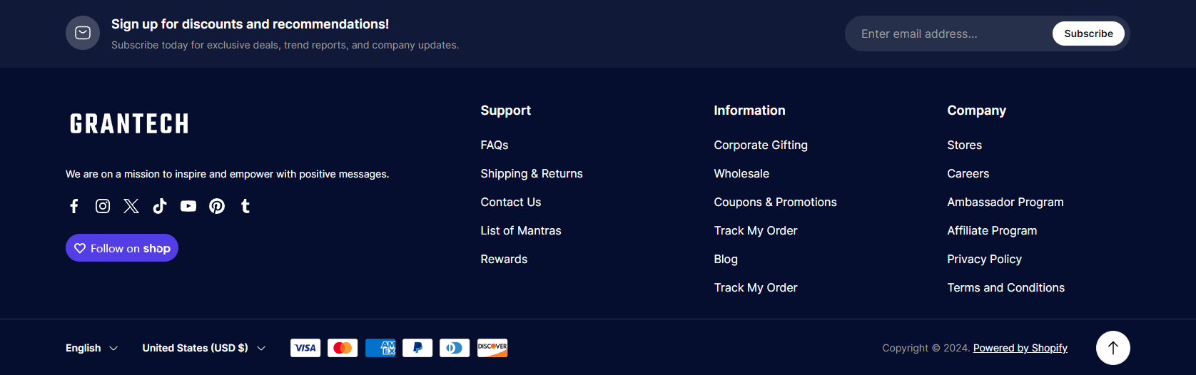
# Footer
## **Adding a section**
The section is static, it is added initially and cannot be removed.
## **Section settings**
### General
1. **`Copyright text`** - the setting allows you to set the **copyright** text, where `%date%` is a **shortcut** that will be replaced with the current year;
2. **`Show back to top button`** - the setting is responsible for showing the scroll to top button’
3. **`Enable rounded footer`** - setting allows you to enable footer with rounded corners.
### Country/Region selector
1. **`Show country/region selector`** - the checkbox is responsible for enabling/disabling change of the country (currency). To manage, go to `settings` → `payments`.
### Language selector
1. **`Show language selector`** - the checkbox is responsible for enabling/disabling language change. To manage, go to `settings` → `languages`.
### Payment methods
1. **`Show payment icons`** - the checkbox is responsible for displaying icons of payment providers. To manage, go to `settings` → `payments`.
### Newsletter
1. **`Show`** - the setting allows you to show a newsletter form;
2. **`Icon`** - the setting allows you to set an icon for the newsletter section;
3. **`Heading`** - the setting allows you to set a heading for the newsletter section;
4. **`Text`** - the setting allows you to set a text content for the newsletter section;
5. **`Placeholder text`** - the setting allows you to set the placeholder text for the form input;
6. **`Button label`** - the setting allows you to set the text for the form button;
7. **`Success message`** - the setting allows you to set the text for the success message after subscribing.
### Colors
1. **`Section background`** - the setting allows you to set the background color;
2. **`Heading`** - the setting allows you to set the color for headings;
3. **`Text`** - the setting allows you to set the color for text;
4. **`Copyright text`** - the setting allows you to set the color for text inside **Copyright**;
5. **`Link`** - the setting allows you to set the color for links;
6. **`Link (hover)`** - the setting allows you to set the color for links on hover;
7. **`Social icon`** - the setting allows you to set the color for the social links icon;
8. **`Social icon (hover)`** - the setting allows you to set the color for the social links icon on hover;
9. **`Newsletter background`** - the setting allows you to set the background for the newsletter section;
10. **`Newsletter icon background`** - the setting allows you to set the background color for the icon of the newsletter section;
11. **`Newsletter heading`** - the setting allows you to set the color for the heading of the newsletter section;
12. **`Newsletter text`** - the setting allows you to set the color for the text of the newsletter section;
13. **`Newsletter input`** - the setting allows you to set the color for the input of the newsletter section;
14. **`Newsletter input placeholder`** - the setting allows you to set the color for the input placeholder of the newsletter section;
15. **`Newsletter input background`** - the setting allows you to set the backround color for the input of the newsletter section;
16. **`Newsletter button`** - the setting allows you to set the color for the submit button of the newsletter section;
17. **`Newsletter button bakground`** - the setting allows you to set the background color for the submit button of the newsletter section;
18. **`Newsletter button (hover)`** - the setting allows you to set the hover color for the submit button of the newsletter section;
19. **`Newsletter button bakground (hover)`** - the setting allows you to set the hover background color for the submit button of the newsletter section;
20. **`Bottom footer border`** - the setting allows you to set the color for the bottom container border;
21. **`Back to top icon`** - the setting allows you to set the color of the back to top button icon;
22. **`Back to top background`** - the setting allows you to set the color background of the back to top button;
23. **`Back to top border`** - the setting allows you to set the border color of the back to top button;
24. **`Back to top icon (hover)`** - the setting allows you to set the color of the back to top button icon on hover;
25. **`Back to top background (hover)`** - the setting allows you to set the color background of the back to top button on hover;
26. **`Back to top border (hover)`** - the setting allows you to set the border color of the back to top button on hover.
## **Blocks settings**
**Total block limit** - **`4`**
### **Block “**Store info**”**
**Block limit** - **`1`**
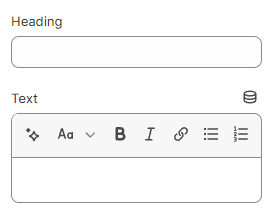
### General
1. **`Heading`** - a field for adding heading content;
2. **`Text`** - a field for adding text content;
### Payment methods
1. **`Show payment icons`** - the checkbox is responsible for displaying icons of payment providers. To manage, go to `settings` → `payments`.
### Follow on shop
1. **`Enable Follow on Shop`** - enable “Follow on Shop” which allows customers to follow your store on the Shop app. Learn more in the [Shopify documentation](https://help.shopify.com/en/manual/online-store/themes/customizing-themes/follow-on-shop).
### **Block “Menu”**
**Block limit** - **`3`**
1. **`Heading`** - text field to add;
2. **`Menu`** - picker menu. Only the first level of links will be displayed.


.png?alt=media&token=8f8d9413-e6a8-43b6-8810-ef1efd07f0ff)